


NONA Biosciences asked us to revitalize their identity while honoring roots tied to fertility, life, and creativity. We shifted the brand toward a tech-forward, biotechnology-focused expression, refining their logo and introducing a high-impact color palette. The result is a modern identity that signals growth and innovation while preserving the symbolism at the heart of their story.


CREATING AN IDENTITY
ONE LETTER AT A TIME
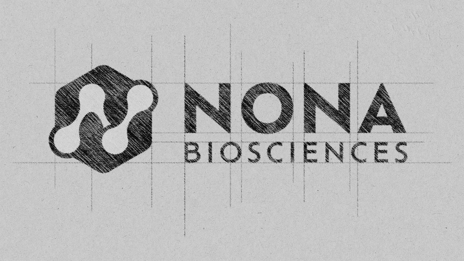
When we started working with Nona, it was clear they had pride in their brand, but recognized it was time for an update. We worked on many iterations, landing on a beautiful modern update for their logo.
KNOCK KNOCK, WHO’S THERE?
ORANGE!
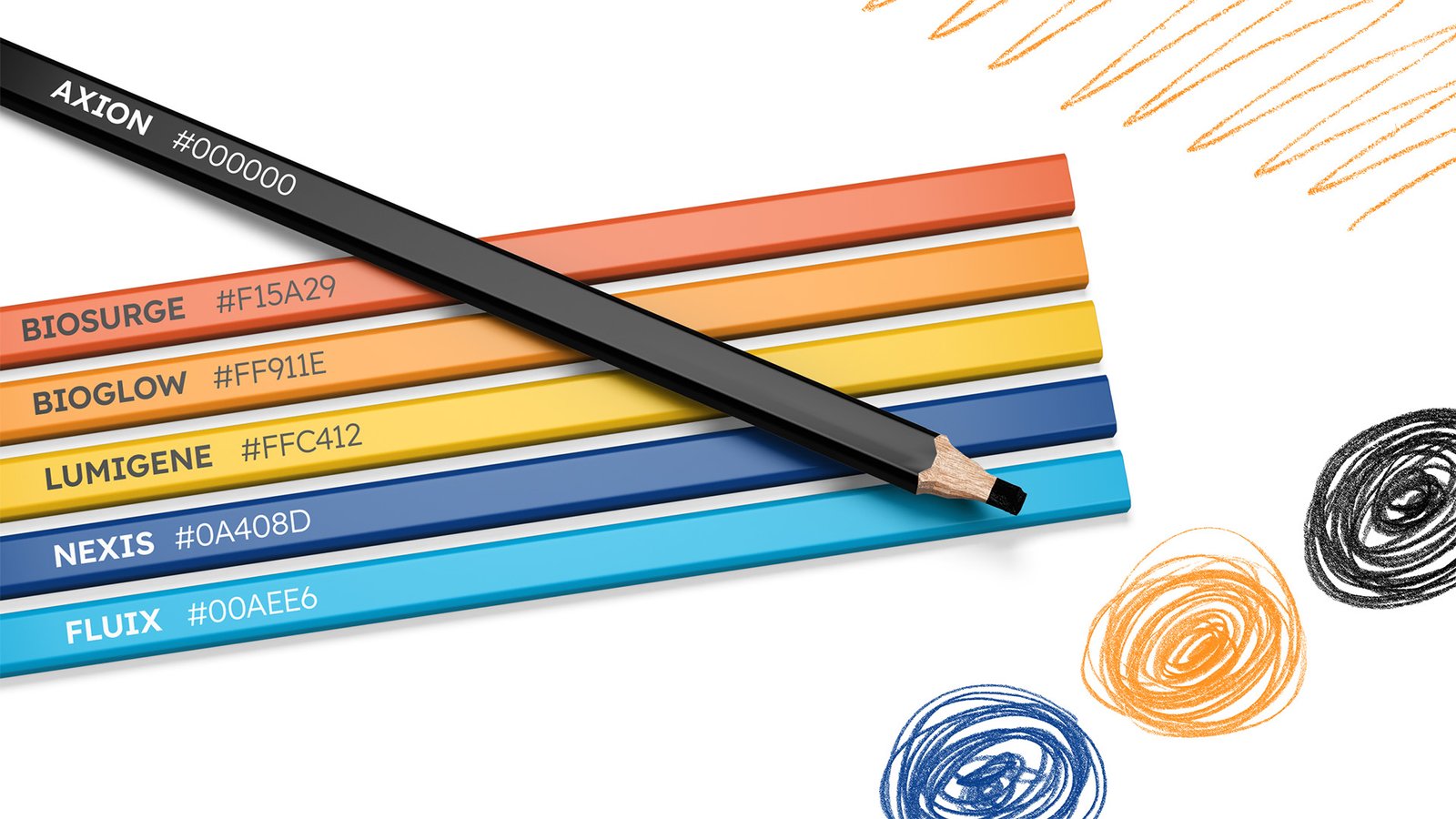
The color orange is such an embodiment of life, sun, vitality, and Nona really wanted to convey that in their color palette. We needed to pair it with some strong complementary colors, and bold accents. These colors are sure to make Nona stand out in the crowd.
HIJKLMN…
OFELIA
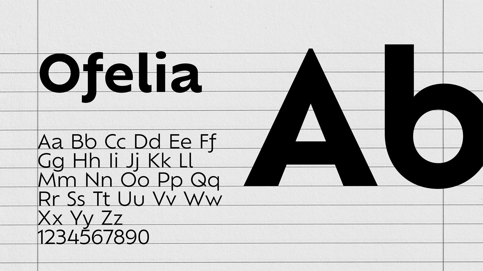
The Ofelia font works perfectly with Nona Biosciences. Crisp, precise, but also adventurous, and explorative. We just know, the fate of Ofelia is in good hands here.
A BRAND GUIDE…
…TO GUIDE YOUR BRAND
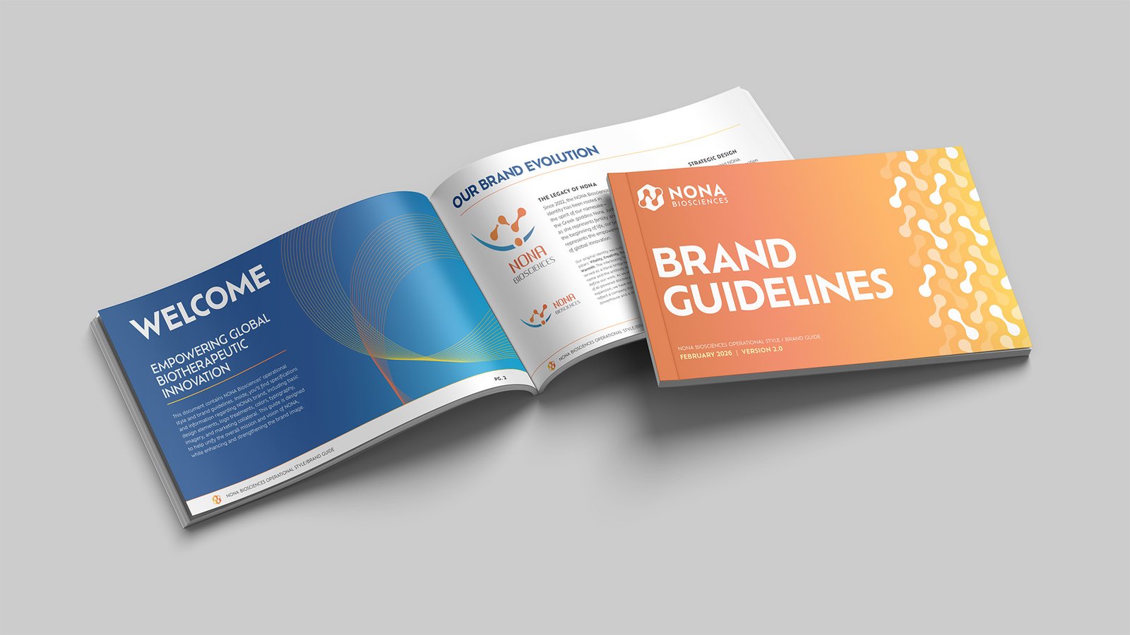
With a multi-national company like Nona Biosciences, the brand guide becomes so important, and you can’t take the risk of leaving something out, something to interpretation. A work in progress, this brand guide will ensure everyone is consistent, and Nona will be recognizable world-wide.
THE PARTNERSHIP
1 full brand refresh
Logo, color palette, and typography brought current for a tech-forward, biotech-focused identity, completed early 2026
Templates and marketing materials
Ongoing production support since the rebrand launched
1 video, and counting
The most recent addition to a growing scope of work
THE SITUATION
Nona needed an identity that honored where they came from — a brand story rooted in fertility, life, and creativity — while signaling where they were headed: a modern, tech-forward biotech presence built to hold up across a multi-national team.
WHAT WE DID
3V worked through several logo iterations to land on a modern mark, built a bold orange-forward palette paired with Ofelia typography, and packaged it into a brand guide — completing the rebrand in early 2026.
BEYOND THE REBRAND
The partnership kept going after launch: templates, marketing materials, and — most recently — a video project, an identity built to be used, not just handed off.